This project was all about giving SkotyDog’s channel a distinct, playful edge, something that stood out in the crowded world of Fortnite content but still felt totally true to his personality. The branding mixes bold, high-energy visuals with touches of irreverence, built to keep fans hooked whether they're watching a quick highlight reel or a full-on gameplay breakdown. It’s branding meant to be just as fun as the content itself.
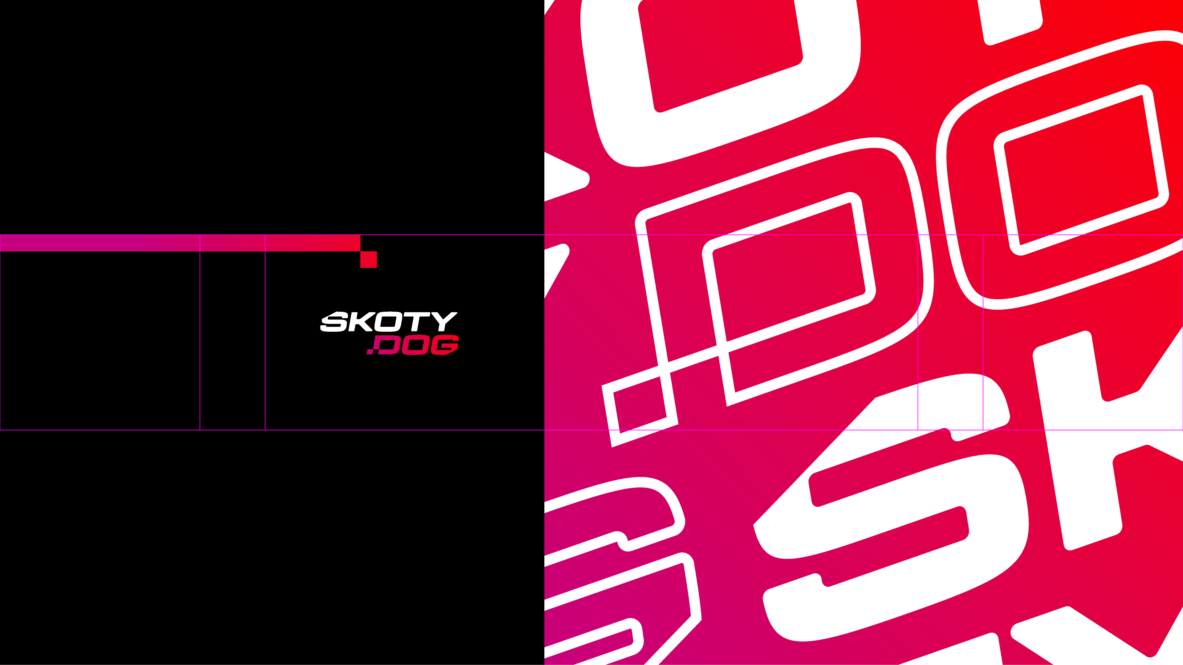
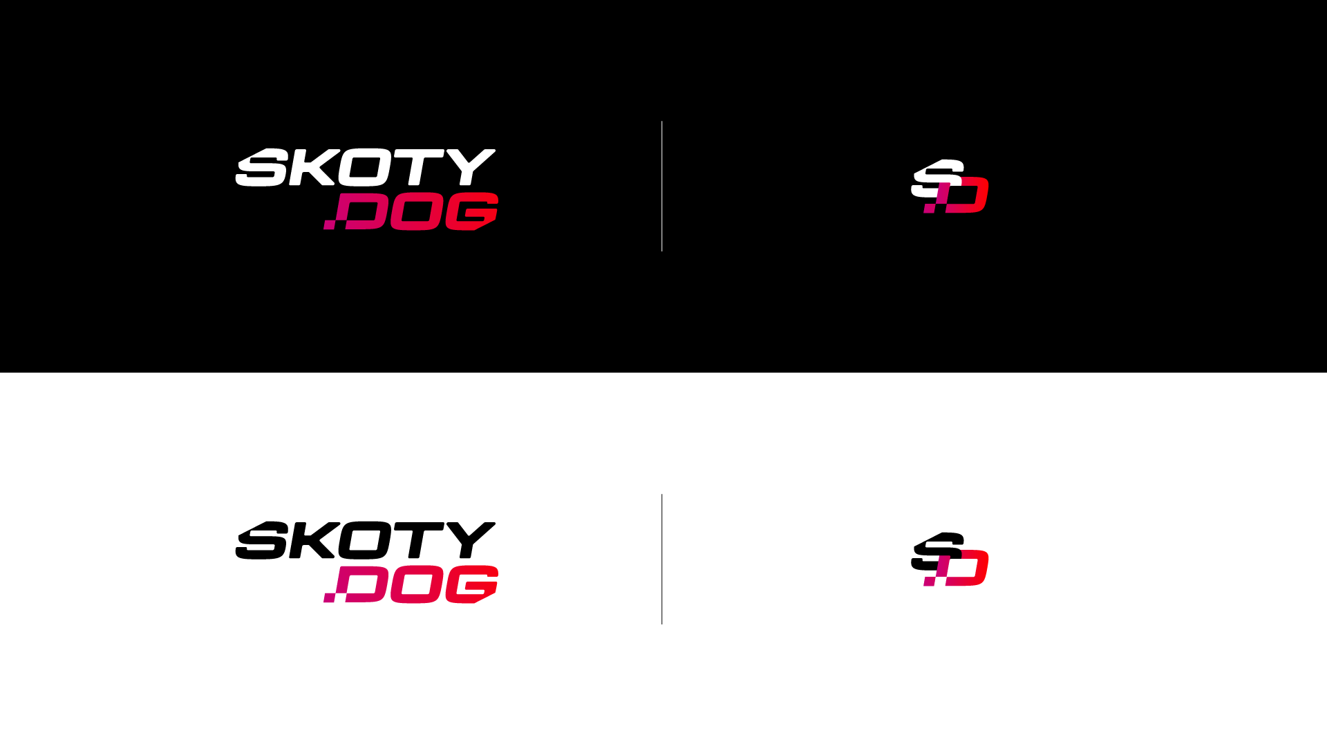
The brand needed to move as easily across YouTube banners and Twitch overlays as it does on thumbnails and merch. There’s a primary logo that’s loud and full of character, plus a set of snappy initials that work perfectly when space is tight. Both versions keep the same playful bite, designed to pop off the screen and stay instantly recognizable no matter where they land.
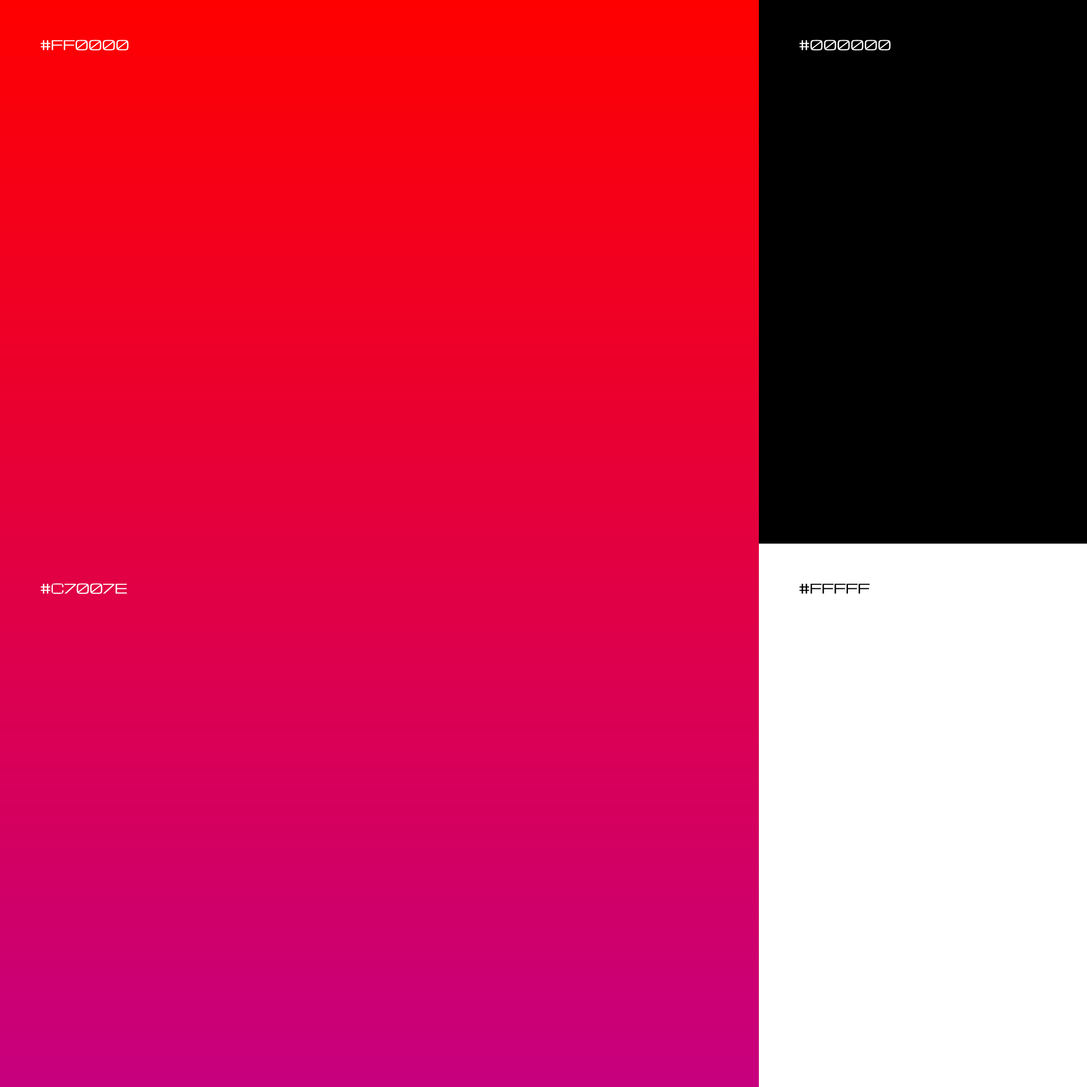
Electric purples, sharp neon accents, and clean contrasting neutrals give the brand a fresh, energetic feel. Supporting graphic elements like shapes, glitch textures, and icon marks bring extra dimension, making sure every scene and still carries that same SkotyDog vibe.
To round it all out, motion graphics were designed to be quick, punchy, and packed with attitude. From animated overlays to slick transition stingers, each piece ties back to the core brand style so everything feels like one seamless universe. Whether tuning in for a livestream or catching a highlight on social, it’s a brand that doesn’t just sit there; it moves, reacts, and keeps up with the game.